
/* ==========================================
手機版響應式設計 (@media max-width: 768px)
========================================== */
@media screen and (max-width: 768px) {
header { padding: 5px 10px !important; min-height: 44px; }
.header-inner { flex-wrap: nowrap !important; gap: 3px !important; display: flex !important; align-items: center !important; justify-content: space-between !important; }
.header-left { flex: 1 1 auto !important; display: flex !important; align-items: center !important; gap: 4px !important; min-width: 0 !important; max-width: 75% !important; flex-shrink: 1 !important; }
.header-left .logo-img { height: 22px !important; width: auto !important; flex-shrink: 0 !important; }
.header-left .company-text .main { font-size: 10px !important; letter-spacing: 0.3px !important; white-space: nowrap !important; overflow: hidden !important; text-overflow: ellipsis !important; display: block !important; }
.header-left .company-text .sub { font-size: 6px !important; white-space: nowrap !important; overflow: hidden !important; text-overflow: ellipsis !important; display: block !important; }
.menu-toggle {
display: block !important;
font-size: 28px;
cursor: pointer;
color: #1a3a6b;
padding: 5px 8px;
user-select: none;
position: absolute;
right: 15px;
top: 12px;
z-index: 10001;
}
nav {
display: none !important;
flex-direction: column;
position: fixed;
top: 0;
right: 0;
width: 260px;
height: 100vh;
background: #fff;
box-shadow: -4px 0 20px rgba(0,0,0,0.15);
z-index: 10000;
padding: 60px 20px 20px;
overflow-y: auto;
align-items: flex-start;
justify-content: flex-start;
}
nav.open { display: flex !important; }
nav a, nav .nav-item > a {
display: block !important;
padding: 12px 10px !important;
font-size: 16px !important;
white-space: normal !important;
border-bottom: 1px solid #eee;
width: 100%;
}
nav .nav-item { display: block !important; width: 100%; }
nav .dropdown-content {
position: static !important;
display: none !important;
box-shadow: none !important;
border: none !important;
background: #f5f7fa !important;
border-radius: 0 !important;
padding: 0 !important;
}
nav .dropdown-content a {
padding: 10px 20px !important;
font-size: 14px !important;
border-bottom: 1px solid #e8e8e8;
}
nav .nav-item.open .dropdown-content { display: block !important; }
nav .nav-item:hover .dropdown-content { display: none !important; }
nav .nav-item.open:hover .dropdown-content { display: block !important; }
nav .nav-item > a::after { content: " ▾"; font-size: 12px; margin-left: 5px; }
nav .nav-item.open > a::after { content: " ▴"; }
.nav-overlay {
display: none;
position: fixed;
top: 0; left: 0; right: 0; bottom: 0;
background: rgba(0,0,0,0.4);
z-index: 9999;
}
.nav-overlay.show { display: block; }
.hero-wrap { margin: 20px auto 0; }
.product-btn { font-size: 14px !important; min-height: 40px !important; padding: 5px 2px !important; }
.product-btn .en { font-size: 10px !important; }
.quality-inner { grid-template-columns: 1fr !important; gap: 20px; }
.about-wrap { padding: 20px 15px; }
.about-wrap h2 { font-size: 20px; }
.about-wrap p { font-size: 12px; }
footer { padding: 20px 15px; }
.footer-inner { flex-direction: column; gap: 20px; }
.page-content { padding: 20px 15px !important; margin: 20px 10px !important; }
.page-content h1 { font-size: 22px !important; }
.product-gallery { grid-template-columns: 1fr !important; }
.product-gallery img { height: auto !important; }
.contact-form { grid-template-columns: 1fr !important; }
.recruit-grid { grid-template-columns: 1fr !important; }
}
/* === 終極手機版強制不換行 (放在 CSS 最底部確保優先) === */
@media screen and (max-width: 768px) {
header { padding: 5px 10px !important; flex-wrap: nowrap !important; }
.header-inner { flex-wrap: nowrap !important; gap: 3px !important; }
.header-left {
flex: 1 1 auto !important;
display: flex !important;
align-items: center !important;
gap: 4px !important;
min-width: 0 !important;
max-width: 75% !important;
flex-shrink: 1 !important;
}
.header-left .logo-img {
height: 22px !important;
width: auto !important;
flex-shrink: 0 !important;
}
.header-left .company-text {
display: flex !important;
flex-direction: column !important;
min-width: 0 !important;
flex-shrink: 1 !important;
overflow: hidden !important;
line-height: 1.1 !important;
}
.header-left .company-text .main {
font-size: 10px !important;
letter-spacing: 0.3px !important;
white-space: nowrap !important;
overflow: hidden !important;
text-overflow: ellipsis !important;
display: block !important;
max-width: 100% !important;
}
.header-left .company-text .sub {
font-size: 6px !important;
white-space: nowrap !important;
overflow: hidden !important;
text-overflow: ellipsis !important;
display: block !important;
max-width: 100% !important;
}
}
/* 極小螢幕 (<375px) 再加強 */
@media screen and (max-width: 374px) {
.header-left .company-text .main { font-size: 8px !important; }
.header-left .company-text .sub { font-size: 5px !important; }
.header-left .logo-img { height: 18px !important; }
.header-left { gap: 2px !important; max-width: 80% !important; }
}
/* 桌機版隱藏漢堡選單按鈕 */
@media screen and (min-width: 769px) {
.menu-toggle { display: none !important; }
}
/* 手機版導航上方品牌區塊 */
@media screen and (max-width: 768px) {
.nav-header-mobile {
display: flex !important;
align-items: center;
gap: 10px;
padding: 15px 10px 20px;
border-bottom: 1px solid #e8e8e8;
margin-bottom: 10px;
width: 100%;
}
}
@media screen and (min-width: 769px) {
.nav-header-mobile { display: none !important; }
}
/* === 手機版子頁面排版 (聯絡我們/人才招募/投資人專區等) === */
@media screen and (max-width: 768px) {
.page-content {
padding: 15px !important;
margin: 15px 10px !important;
}
.page-content h1 { font-size: 20px !important; }
.page-content p, .page-content li { font-size: 14px !important; }
.product-gallery { grid-template-columns: 1fr !important; }
.product-gallery img { height: auto !important; }
/* 聯絡表單 */
.contact-form { grid-template-columns: 1fr !important; }
/* 招募表格 */
.recruit-grid { grid-template-columns: 1fr !important; }
/* 技術資料 PDF 列表 */
.pdf-list { grid-template-columns: 1fr !important; }
.page-content table { display: block; overflow-x: auto; }
/* 產品頁面 2x2 網格 */
.page-content div[style*="grid-template-columns:repeat(2"] {
grid-template-columns: repeat(2, 1fr) !important;
}
}
@media screen and (max-width: 480px) {
.page-content div[style*="grid-template-columns:repeat(2"] {
grid-template-columns: 1fr !important;
}
}
/* === 地址卡片 + 微信聯絡 === */
.address-card {
display: flex;
align-items: flex-start;
gap: 15px;
background: #fff;
border: 1px solid #e0e0e0;
border-radius: 10px;
padding: 20px;
margin-bottom: 15px;
box-shadow: 0 2px 8px rgba(0,0,0,0.04);
}
.address-card-icon {
font-size: 28px;
flex-shrink: 0;
margin-top: 2px;
}
.address-card-text h4 {
color: #1a3a6b;
font-size: 16px;
margin-bottom: 5px;
font-weight: 700;
}
.address-card-text p {
color: #555;
font-size: 12px;
line-height: 1.6;
margin: 0;
}
.address-tel {
color: #888 !important;
font-size: 13px !important;
margin-top: 5px !important;
}
.wechat-card {
background: linear-gradient(135deg, #07c160, #06ad56);
border-radius: 10px;
padding: 25px;
margin-top: 20px;
display: flex;
align-items: flex-start;
gap: 15px;
box-shadow: 0 4px 15px rgba(7,193,96,0.2);
}
.wechat-icon {
font-size: 36px;
flex-shrink: 0;
}
.wechat-text h4 {
color: #fff;
font-size: 18px;
margin-bottom: 5px;
font-weight: 700;
}
.wechat-text p {
color: rgba(255,255,255,0.85);
font-size: 12px;
margin-bottom: 12px;
line-height: 1.5;
}
.wechat-btn {
display: inline-flex;
align-items: center;
gap: 8px;
background: #fff;
color: #07c160 !important;
padding: 10px 24px;
border-radius: 6px;
font-size: 15px;
font-weight: 600;
text-decoration: none !important;
transition: transform 0.2s, box-shadow 0.2s;
}
.wechat-btn:hover {
transform: translateY(-1px);
box-shadow: 0 4px 12px rgba(0,0,0,0.15);
}
.wechat-btn-icon { font-size: 18px; }
@media screen and (max-width: 768px) {
.wechat-card { flex-direction: column; align-items: center; text-align: center; }
.wechat-btn { width: 100%; justify-content: center; }
}
/* 手機版側邊選單品牌區塊 - 調整大小 */
@media screen and (max-width: 768px) {
.nav-header-mobile {
display: flex !important;
align-items: center;
gap: 12px;
padding: 20px 15px 25px;
border-bottom: 1px solid #e8e8e8;
margin-bottom: 10px;
width: 100%;
}
.nav-header-mobile img {
height: 42px !important;
width: auto !important;
}
.nav-header-mobile span:first-of-type {
font-size: 22px !important;
}
.nav-header-mobile span:last-of-type {
font-size: 14px !important;
}
}
Plastic Tube
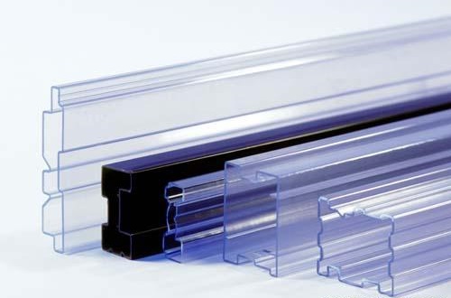
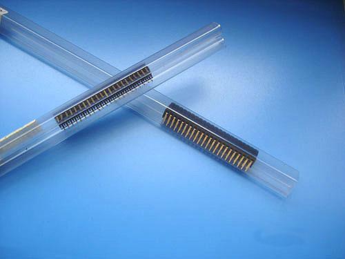
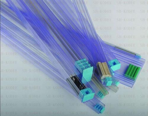
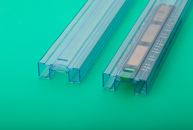
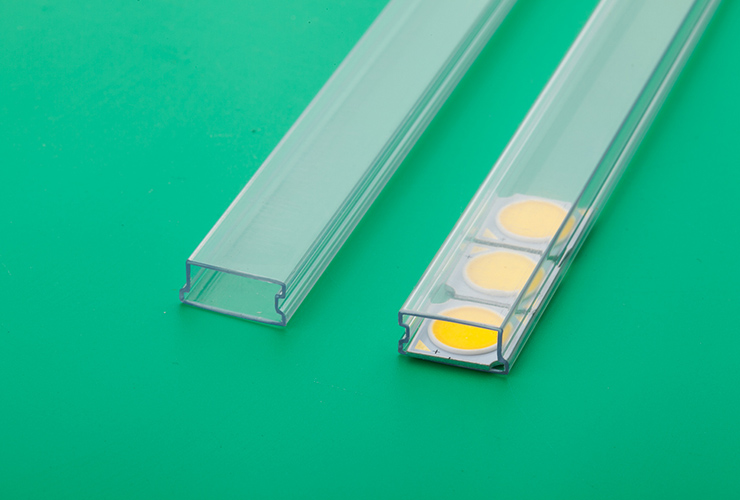
Toplink Technology's plastic tubes provide reliable protection for SMD components during packaging and transportation. Made from high-quality materials with excellent strength, impact resistance, and anti-static properties, our plastic tubes ensure components are properly protected. We offer a wide range of tube specifications to accommodate various electronic component sizes, including ICs, LEDs, DIP packages, and more.
IC Type
For IC electronic component packaging
LED Type
For LED digital tube packaging
DIP Type
For DIP packaged components
Threaded Tube Plug
Threaded tube plug accessories
Rubber Tube Plug
Rubber tube plug accessories
Snap-in Tube Plug
Snap-in tube plug accessories