
/* ========================================== 手機版響應式設計 (@media max-width: 768px) ========================================== */ @media screen and (max-width: 768px) { header { padding: 5px 10px !important; min-height: 44px; } .header-inner { flex-wrap: nowrap !important; gap: 3px !important; display: flex !important; align-items: center !important; justify-content: space-between !important; } .header-left { flex: 1 1 auto !important; display: flex !important; align-items: center !important; gap: 4px !important; min-width: 0 !important; max-width: 75% !important; flex-shrink: 1 !important; } .header-left .logo-img { height: 22px !important; width: auto !important; flex-shrink: 0 !important; } .header-left .company-text .main { font-size: 10px !important; letter-spacing: 0.3px !important; white-space: nowrap !important; overflow: hidden !important; text-overflow: ellipsis !important; display: block !important; } .header-left .company-text .sub { font-size: 6px !important; white-space: nowrap !important; overflow: hidden !important; text-overflow: ellipsis !important; display: block !important; } .menu-toggle { display: block !important; font-size: 28px; cursor: pointer; color: #1a3a6b; padding: 5px 8px; user-select: none; position: absolute; right: 15px; top: 12px; z-index: 10001; } nav { display: none !important; flex-direction: column; position: fixed; top: 0; right: 0; width: 260px; height: 100vh; background: #fff; box-shadow: -4px 0 20px rgba(0,0,0,0.15); z-index: 10000; padding: 60px 20px 20px; overflow-y: auto; align-items: flex-start; justify-content: flex-start; } nav.open { display: flex !important; } nav a, nav .nav-item > a { display: block !important; padding: 12px 10px !important; font-size: 16px !important; white-space: normal !important; border-bottom: 1px solid #eee; width: 100%; } nav .nav-item { display: block !important; width: 100%; } nav .dropdown-content { position: static !important; display: none !important; box-shadow: none !important; border: none !important; background: #f5f7fa !important; border-radius: 0 !important; padding: 0 !important; } nav .dropdown-content a { padding: 10px 20px !important; font-size: 14px !important; border-bottom: 1px solid #e8e8e8; } nav .nav-item.open .dropdown-content { display: block !important; } nav .nav-item:hover .dropdown-content { display: none !important; } nav .nav-item.open:hover .dropdown-content { display: block !important; } nav .nav-item > a::after { content: " ▾"; font-size: 12px; margin-left: 5px; } nav .nav-item.open > a::after { content: " ▴"; } .nav-overlay { display: none; position: fixed; top: 0; left: 0; right: 0; bottom: 0; background: rgba(0,0,0,0.4); z-index: 9999; } .nav-overlay.show { display: block; } .hero-wrap { margin: 20px auto 0; } .product-btn { font-size: 14px !important; min-height: 40px !important; padding: 5px 2px !important; } .product-btn .en { font-size: 10px !important; } .quality-inner { grid-template-columns: 1fr !important; gap: 20px; } .about-wrap { padding: 20px 15px; } .about-wrap h2 { font-size: 20px; } .about-wrap p { font-size: 12px; } footer { padding: 20px 15px; } .footer-inner { flex-direction: column; gap: 20px; } .page-content { padding: 20px 15px !important; margin: 20px 10px !important; } .page-content h1 { font-size: 22px !important; } .product-gallery { grid-template-columns: 1fr !important; } .product-gallery img { height: auto !important; } .contact-form { grid-template-columns: 1fr !important; } .recruit-grid { grid-template-columns: 1fr !important; } } /* === 終極手機版強制不換行 (放在 CSS 最底部確保優先) === */ @media screen and (max-width: 768px) { header { padding: 5px 10px !important; flex-wrap: nowrap !important; } .header-inner { flex-wrap: nowrap !important; gap: 3px !important; } .header-left { flex: 1 1 auto !important; display: flex !important; align-items: center !important; gap: 4px !important; min-width: 0 !important; max-width: 75% !important; flex-shrink: 1 !important; } .header-left .logo-img { height: 22px !important; width: auto !important; flex-shrink: 0 !important; } .header-left .company-text { display: flex !important; flex-direction: column !important; min-width: 0 !important; flex-shrink: 1 !important; overflow: hidden !important; line-height: 1.1 !important; } .header-left .company-text .main { font-size: 10px !important; letter-spacing: 0.3px !important; white-space: nowrap !important; overflow: hidden !important; text-overflow: ellipsis !important; display: block !important; max-width: 100% !important; } .header-left .company-text .sub { font-size: 6px !important; white-space: nowrap !important; overflow: hidden !important; text-overflow: ellipsis !important; display: block !important; max-width: 100% !important; } } /* 極小螢幕 (<375px) 再加強 */ @media screen and (max-width: 374px) { .header-left .company-text .main { font-size: 8px !important; } .header-left .company-text .sub { font-size: 5px !important; } .header-left .logo-img { height: 18px !important; } .header-left { gap: 2px !important; max-width: 80% !important; } } /* 桌機版隱藏漢堡選單按鈕 */ @media screen and (min-width: 769px) { .menu-toggle { display: none !important; } } /* 手機版導航上方品牌區塊 */ @media screen and (max-width: 768px) { .nav-header-mobile { display: flex !important; align-items: center; gap: 10px; padding: 15px 10px 20px; border-bottom: 1px solid #e8e8e8; margin-bottom: 10px; width: 100%; } } @media screen and (min-width: 769px) { .nav-header-mobile { display: none !important; } } /* === 手機版子頁面排版 (聯絡我們/人才招募/投資人專區等) === */ @media screen and (max-width: 768px) { .page-content { padding: 15px !important; margin: 15px 10px !important; } .page-content h1 { font-size: 20px !important; } .page-content p, .page-content li { font-size: 14px !important; } .product-gallery { grid-template-columns: 1fr !important; } .product-gallery img { height: auto !important; } /* 聯絡表單 */ .contact-form { grid-template-columns: 1fr !important; } /* 招募表格 */ .recruit-grid { grid-template-columns: 1fr !important; } /* 技術資料 PDF 列表 */ .pdf-list { grid-template-columns: 1fr !important; } .page-content table { display: block; overflow-x: auto; } /* 產品頁面 2x2 網格 */ .page-content div[style*="grid-template-columns:repeat(2"] { grid-template-columns: repeat(2, 1fr) !important; } } @media screen and (max-width: 480px) { .page-content div[style*="grid-template-columns:repeat(2"] { grid-template-columns: 1fr !important; } } /* 手機版側邊選單品牌區塊 - 調整大小 */ @media screen and (max-width: 768px) { .nav-header-mobile { display: flex !important; align-items: center; gap: 12px; padding: 20px 15px 25px; border-bottom: 1px solid #e8e8e8; margin-bottom: 10px; width: 100%; } .nav-header-mobile img { height: 42px !important; width: auto !important; } .nav-header-mobile span:first-of-type { font-size: 22px !important; } .nav-header-mobile span:last-of-type { font-size: 14px !important; } }
Toplink Logo
拓 霖 科 技 Toplink Technology Co., LTD

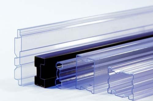
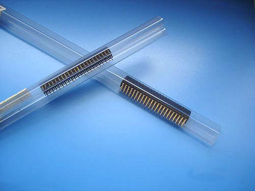
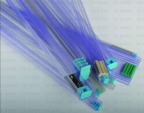
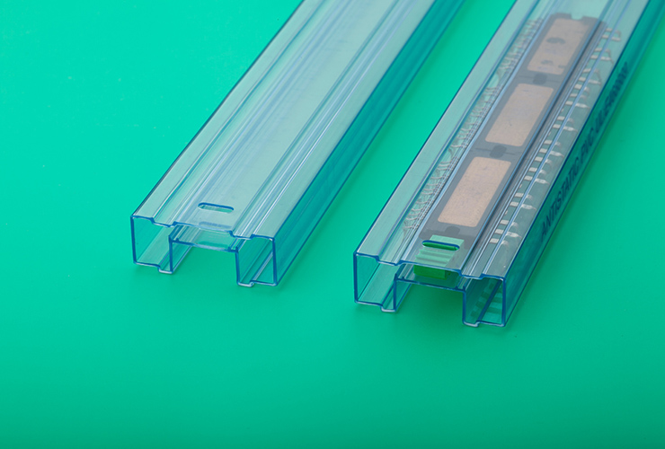
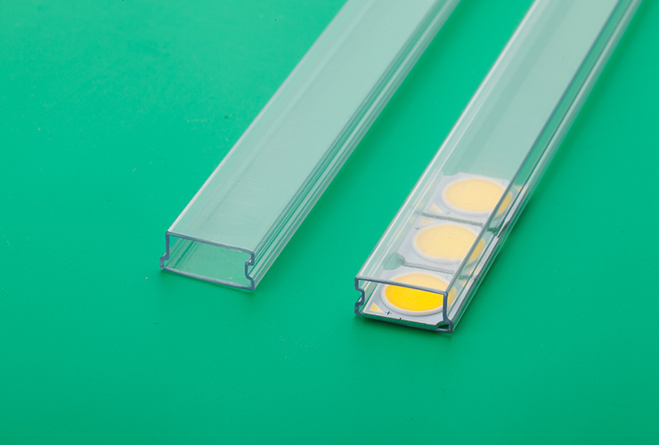
料管 - Plastic TUBE


在包裝運送SMD元件時, 除了選擇適合的壓紋承載帶外, 另外是否搭配高強度性,高耐抗性&抗靜電能力的塑膠卷軸決定了最終元件包裝是否完善的重要因素之一. 我們的HIPS (High-Impact Polystyrene高強度PS)系列塑膠卷軸提供SMD元件最完美的保護, 另外同時也提供高溫烘烤80˚C專用的PC, 合金以及ABS塑膠卷軸系列供客戶選擇.

IC 類型

適用於 IC 類電子零件包裝

LED 類型

適用於 LED 數碼管包裝

DIP 類型

適用於 DIP 封裝元件

螺紋型膠塞

螺紋式膠塞配件

橡膠型膠塞

橡膠式膠塞配件

卡扣型膠塞

卡扣式膠塞配件